If you are looking for a powerful way to visualize geographic data then you should learn to use interactive Choropleth maps. A Choropleth map represents statistical data through various shading patterns or symbols on predetermined geographic areas such as countries, states or counties. Static Choropleth maps are useful for showing one view of data, but an interactive Choropleth map is much more powerful and allows the user to select the data they prefer to view.
The interactive chart below provides details on San Francisco single family homes sales. The chart breaks down the single family home sales by Median Sales Price, Minimum Income Required, Average Sales Price, Average Sales Price Per Square Foot, Average Square Footage and Number of Sales all by neighborhood and year (10 years of data).
If you’d like to understand how to develop your own interactive map follow along as I step you through the process.
A Word About the Code
All the code, data and associated files for the project can be accessed at my GitHub. The final Colab code for running on the Bokeh server can be found here. A test version of the Colab code skipping the data cleaning and wrangling steps can be found here.
Using Python and Bokeh
After exploring several different approaches, I found the combination of Python and Bokeh to be the most straightforward and well-documented method for creating interactive maps.
Let’s start with the installs and imports you will need for the graphs. Pandas, numpy and math are standard Python libraries used to clean and wrangle the data. The geopandas, json and bokeh imports are libraries needed for the mapping.
I work in Colab and needed to install fiona and geopandas.
!pip install fiona
!pip install geopandas
Imports
# Import libraries
import pandas as pd
import numpy as np
import math

import geopandas
import json

from bokeh.io import output_notebook, show, output_file
from bokeh.plotting import figure
from bokeh.models import GeoJSONDataSource, LinearColorMapper, ColorBar, NumeralTickFormatter
from bokeh.palettes import brewer

from bokeh.io.doc import curdoc
from bokeh.models import Slider, HoverTool, Select
from bokeh.layouts import widgetbox, row, column
Data Loading, Cleaning and Wrangling
As the focus of this article is on the creation of interactive maps, I will briefly describe the steps used to load, clean and wrangle the data. You can view the full cleaning and wrangling here if you are interested.
Since I have a real estate license I have access to the San Francisco MLS which I used to download 10 years (2009–2018) of single-family home sales data by neighborhood into the sf_data dataframe.
An important piece of data, house square footage, was zero for about 16% of the data. A reasonable approach to filling the data is to use the average house square footage by bedroom for all single family homes in San Francisco. For example, all one bedroom homes with zero values were filled with the average square footage of all one bedroom home sales in San Francisco.
A key column of the data is the neighborhood code which needs to match the mapping code for the neighborhood. This will allow us to merge the data with the map. A dictionary is used to change the neighborhood codes in the data to match the neighborhood codes in the map.
Finally a year and price per square foot column are added to sf_data and the sf_data is summarized using groupby and aggregate functions to create the final neighborhood_data dataframe with all numeric fields converted to integer values for ease in displaying the data:
neighborhood_data DataFrame
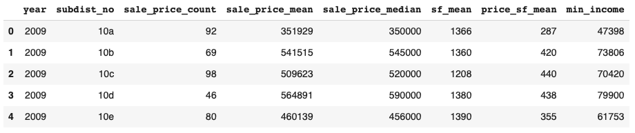
The neighborhood_data dataframe repesents the single-family home sales by year summarized by neighborhood. Now we need to map this data onto a San Francisco neighborhood map.
Here’s a shortcut to the cleaned data:
neighborhood_data = pd.read_csv('https://raw.githubusercontent.com/JimKing100/SF_Real_Estate_Live/master/data/neighborhood_data.csv')
Prepare the Mapping Data and GeoDataFrame
Bokeh offers several ways to work with geographical data including Tile Provider Maps, Google Maps and GeoJSON data. We will be working with GeoJSON, a popular open standard for representing geographical features with JSON. JSON (JavaScript Object Notation), is a minimal, readable format for structuring data. Bokeh uses JSON to transmit data between a bokeh server and a web application.
In a typical Bokeh interactive graph the data source needs to be a ColumnDataSource. This is a key concept in Bokeh. However, when using a map we use a GeoJSONDataSource instead.
To make our work with geospatial data in Python easier we use GeoPandas. It combines the capabilities of pandas and shapely, providing geospatial operations in pandas and a high-level interface to multiple geometries to shapely. We will use GeoPandas to create a GeoDataFrame - a precursor to creating the GeoJSONDataSource.
Finally, we need a map that is in geojson format. San Francisco, through their DataSF web site, has an exportable neighborhood map in geojson format.
Let’s walk through the following code to show how a GeoDataFrame is created.
# Read the geojson map file for Realtor Neighborhoods into a GeoDataframe object
sf = geopandas.read_file('https://raw.githubusercontent.com/JimKing100/SF_Real_Estate_Live/master/data/Realtor%20Neighborhoods.geojson')

# Set the Coordinate Referance System (crs) for projections
# ESPG code 4326 is also referred to as WGS84 lat-long projection
sf.crs = {'init': 'epsg:4326'}

# Rename columns in geojson map file
sf = sf.rename(columns={'geometry': 'geometry','nbrhood':'neighborhood_name', 'nid': 'subdist_no'}).set_geometry('geometry')

# Change neighborhood id (subdist_no) for correct code for Mount Davidson Manor and for parks
sf.loc[sf['neighborhood_name'] == 'Mount Davidson Manor', 'subdist_no'] = '4n'
sf.loc[sf['neighborhood_name'] == 'Golden Gate Park', 'subdist_no'] = '12a'
sf.loc[sf['neighborhood_name'] == 'Presidio', 'subdist_no'] = '12b'
sf.loc[sf['neighborhood_name'] == 'Lincoln Park', 'subdist_no'] = '12c'

sf.sort_values(by=['subdist_no'])
We use geopandas to read the geojson map into the GeoDataFrame sf. We then set the coordinate reference system to lat-long projection. Next, we rename several columns and use set_geometry to set the GeoDataFrame to column ‘geometry’ containing the active geometry (the description of the shapes to draw). Finally, we clean up some neighborhood id’s to match neighborhood_data.
sf GeoDataFrame
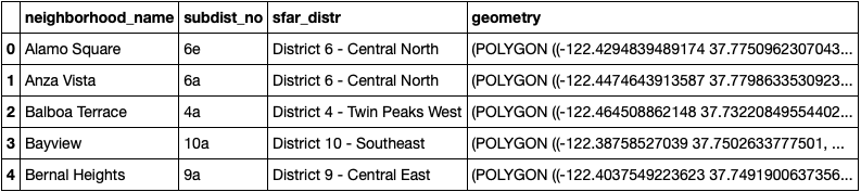
We now have our neighborhood data in neighborhood_data and our mapping data in sf. Notice they both have the column subdist_no (the neighborhood identifier) in common.
Create the JSON Data for the GeoJSONDataSource
We now need to create a function that merges our neighborhood data with our mapping data and converts it into JSON format for the Bokeh server.
# Create a function the returns json_data for the year selected by the user
def json_data(selectedYear):
    yr = selectedYear

    # Pull selected year from neighborhood summary data
    df_yr = neighborhood_data[neighborhood_data['year'] == yr]

    # Merge the GeoDataframe object (sf) with the neighborhood summary data (neighborhood)
    merged = pd.merge(sf, df_yr, on='subdist_no', how='left')

    # Fill the null values
    values = {'year': yr, 'sale_price_count': 0, 'sale_price_mean': 0, 'sale_price_median': 0,
              'sf_mean': 0, 'price_sf_mean': 0, 'min_income': 0}
    merged = merged.fillna(value=values)

    # Bokeh uses geojson formatting, representing geographical features, with json
    # Convert to json
    merged_json = json.loads(merged.to_json())

    # Convert to json preferred string-like object
    json_data = json.dumps(merged_json)
    return json_data
We pass the json_data function the year of data we would like loaded (e.g. 2018). We then pull the data from neighborhood_data for the selected year and merge it with the mapping data in sf. After filling the null values with zeros (neighborhoods with no sales such as Golden Gate Park), we convert the merged file into JSON format using json.loads and json.dumps returning the JSON formatted data in json_data.
Main Code for Interactive Map
We still need several pieces of code to make the interactive map including a ColorBar, Bokeh widgets and tools, a plotting function and an update function, but before we go into detail on those pieces let’s take a look at the main code.
# Input geojson source that contains features for plotting for:
# initial year 2018 and initial criteria sale_price_median
geosource = GeoJSONDataSource(geojson = json_data(2018))
input_field = 'sale_price_median'

# Define a sequential multi-hue color palette.
palette = brewer['Blues'][8]

# Reverse color order so that dark blue is highest obesity.
palette = palette[::-1]

# Add hover tool
hover = HoverTool(tooltips = [ ('Neighborhood','@neighborhood_name'),
                               ('# Sales', '@sale_price_count'),
                               ('Average Price', '$@sale_price_mean{,}'),
                               ('Median Price', '$@sale_price_median{,}'),
                               ('Average SF', '@sf_mean{,}'),
                               ('Price/SF ', '$@price_sf_mean{,}'),
                               ('Income Needed', '$@min_income{,}')])

# Call the plotting function
p = make_plot(input_field)

# Make a slider object: slider
slider = Slider(title = 'Year',start = 2009, end = 2018, step = 1, value = 2018)
slider.on_change('value', update_plot)

# Make a selection object: select
select = Select(title='Select Criteria:', value='Median Sales Price', options=['Median Sales Price', 'Minimum Income Required',
                                                                               'Average Sales Price', 'Average Price Per Square Foot',
                                                                               'Average Square Footage', 'Number of Sales'])
select.on_change('value', update_plot)

# Make a column layout of widgetbox(slider) and plot, and add it to the current document
# Display the current document
layout = column(p, widgetbox(select), widgetbox(slider))
curdoc().add_root(layout)
Let’s break the code down :
-
Create our GeoJSONDataSource object with our initial data from 2018.
-
Define the color palette to use for the ColorBar and neighborhood map values.
-
Add a Bokeh HoverTool that displays data when hovering over a neighborhood.
-
Call a plotting function to create the map plot using sale_price_median as the initial_data (the median sales price).
-
Add a Bokeh Slider widget that enables a user to change the data based on year.
-
Add a Bokeh Select widget that enables a user to select the data based on criteria (e.g. Median Sales Price or Minimum Income Required).
-
Layout the map plot and widgets in a column and output the results to a document displayed by the Bokeh server.
The ColorBar
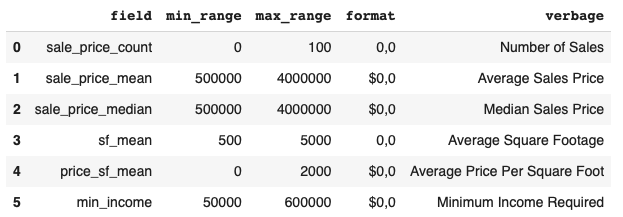
The ColorBar turned out to be a bit more challenging than I expected. It turns out that the ColorBar is “attached” to the plot and the entire plot needs to be refreshed when a change in the criteria is requested. Each criteria has it’s own unique minimum and maximum range, format for displaying and verbage. For example, Number of Sales has a range of 0–100, a format as an integer and the name “Number of Sales” that needs to be changed in the title of the plot. So I created a format_df that details the data needed in the ColorBar and plot title.
# This dictionary contains the formatting for the data in the plots
format_data = [('sale_price_count', 0, 100,'0,0', 'Number of Sales'),
               ('sale_price_mean', 500000, 4000000,'$0,0', 'Average Sales Price'),
               ('sale_price_median', 500000, 4000000, '$0,0', 'Median Sales Price'),
               ('sf_mean', 500, 5000,'0,0', 'Average Square Footage'),
               ('price_sf_mean', 0, 2000,'$0,0', 'Average Price Per Square Foot'),
               ('min_income', 50000, 600000,'$0,0', 'Minimum Income Required')
              ]

#Create a DataFrame object from the dictionary
format_df = pd.DataFrame(format_data, columns = ['field' , 'min_range', 'max_range' , 'format', 'verbage'])
format_df DataFrame
The HoverTool
The HoverTool is a fairly straightforward Bokeh tool that allows the user to hover over an item and display values. In the main code we insert HoverTool code and tell it to use the data based on the neighborhood_name and display the six criteria using “@” to indicate the column values.
# Add hover tool
hover = HoverTool(tooltips = [ ('Neighborhood','@neighborhood_name'),
                               ('# Sales', '@sale_price_count'),
                               ('Average Price', '$@sale_price_mean{,}'),
                               ('Median Price', '$@sale_price_median{,}'),
                               ('Average SF', '@sf_mean{,}'),
                               ('Price/SF ', '$@price_sf_mean{,}'),
                               ('Income Needed', '$@min_income{,}')])
Widgets and The Callback Function
We use two Bokeh widgets, the Slider object and the Select object. In our example, the Slider object allows the user to select the Year (or row) to display and the Select object allows the user to select the criteria (or column).
Both widgets work on the same principle - the callback. In the code below, the widgets pass a ‘value’ and call a function named update_plot when the .on_change method is called (when a change is made using the widget - the event handler).
# Make a slider object: slider
slider = Slider(title = 'Year',start = 2009, end = 2018, step = 1, value = 2018)
slider.on_change('value', update_plot)

# Make a selection object: select
select = Select(title='Select Criteria:', value='Median Sales Price', options=['Median Sales Price', 'Minimum Income Required',
                                                                               'Average Sales Price', 'Average Price Per Square Foot',
                                                                               'Average Square Footage', 'Number of Sales'])
select.on_change('value', update_plot)
The callback function update_plot has three parameters. The attr parameter is simply the ‘value’ you passed (e.g. slider.value or select.value), the old and new are internal parameters used by Bokeh and you do not need to deal with them.
Depending on the widget used, we either select new_data (Slider) based on year (yr) or re-set the input_field (Select) based on criteria (cr). We then re-set the plot based on the current input_field.
Finally, we layout the plot and widgets, clear the old document and output the new document with the new data.
# Define the callback function: update_plot
def update_plot(attr, old, new):
    # The input yr is the year selected from the slider
    yr = slider.value
    new_data = json_data(yr)

    # The input cr is the criteria selected from the select box
    cr = select.value
    input_field = format_df.loc[format_df['verbage'] == cr, 'field'].iloc[0]

    # Update the plot based on the changed inputs
    p = make_plot(input_field)

    # Update the layout, clear the old document and display the new document
    layout = column(p, widgetbox(select), widgetbox(slider))
    curdoc().clear()
    curdoc().add_root(layout)

    # Update the data
    geosource.geojson = new_data
Create a Plotting Function
The final piece is make_plot, the plotting function. Let’s break this down:
-
We pass it the field_name to indicate which column of data we want to plot (e.g. Median Sales Price).
-
Using the format_df we pull out the minimum range, maximum range and formatting for the ColorBar.
-
We call Bokeh’s LinearColorMapper to set the palette and range of the colorbar.
-
We create the ColorBar using Bokeh’s NumeralTickFormatter and ColorBar.
-
We create the plot figure with appropriate title.
-
We create the “patches”, in our case the neighborhood polygons, using Bokeh’s p.patches glyph using the data in geosource.
-
We add the ColorBar and the HoverTool to the plot and return the plot p.
# Create a plotting function
def make_plot(field_name):
  # Set the format of the colorbar
  min_range = format_df.loc[format_df['field'] == field_name, 'min_range'].iloc[0]
  max_range = format_df.loc[format_df['field'] == field_name, 'max_range'].iloc[0]
  field_format = format_df.loc[format_df['field'] == field_name, 'format'].iloc[0]

  # Instantiate LinearColorMapper that linearly maps numbers in a range, into a sequence of colors.
  color_mapper = LinearColorMapper(palette = palette, low = min_range, high = max_range)

  # Create color bar.
  format_tick = NumeralTickFormatter(format=field_format)
  color_bar = ColorBar(color_mapper=color_mapper, label_standoff=18, formatter=format_tick,
  border_line_color=None, location = (0, 0))

  # Create figure object.
  verbage = format_df.loc[format_df['field'] == field_name, 'verbage'].iloc[0]

  p = figure(title = verbage + ' by Neighborhood for Single Family Homes in SF by Year - 2009 to 2018',
             plot_height = 650, plot_width = 850,
             toolbar_location = None)
  p.xgrid.grid_line_color = None
  p.ygrid.grid_line_color = None
  p.axis.visible = False

  # Add patch renderer to figure.
  p.patches('xs','ys', source = geosource, fill_color = {'field' : field_name, 'transform' : color_mapper},
          line_color = 'black', line_width = 0.25, fill_alpha = 1)

  # Specify color bar layout.
  p.add_layout(color_bar, 'right')

  # Add the hover tool to the graph
  p.add_tools(hover)
  return p
Putting it All Together
The test code puts this all together and prints out a static map with the ColorBar and HoverTool in the Colab notebook. In order to see the interactive components using Slider and Select you will need to use the Bokeh server in the next steps. (You will need the fiona and geopandas imports to run the test code)
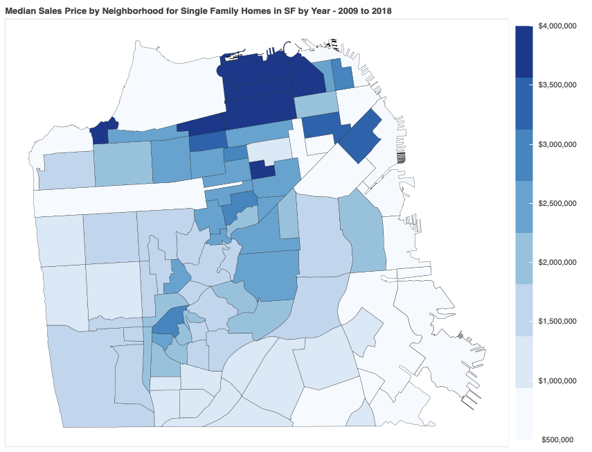
The Static Map with ColorBar and HoverTool
The Local Bokeh Server
I developed the static map using 2018 data and Median Sales Price in Colab in order to get the majority of the code working prior to adding the interactive portions. In order to test and view the interactive components of Bokeh, we need to follow these steps.
-
Install the Bokeh server on your computer.
-
Download the .ipynb file to a local directory on your computer.
-
From the terminal change the directory to the directory with the .ipynb file.
-
From the terminal run the following command: bokeh serve (two dashes)show filename.ipynb
-
This should open a local host on your browser and output your interactive graph. If there is an error it should be visible in the terminal.
Public Access to the Interactive Graph via Heroku
Once you get the interactive graph working locally, you can let others access it by using a public Bokeh hosting service such as Heroku. Heroku will host the interactive graph allowing you to link to it or use an iframe (as in this article).
The basic steps to host on Heroku are:
-
Change the Colab notebook to comment out the install of fiona and geopandas. Heroku has these items and the build will fail if they are in the code.
-
Change the Colab notebook to comment out the last two lines (output_notebook() and show(p)).
-
Download the Colab notebook as a .py file and upload it to a GitHub repository.
-
Create a Heroku app and connect to your GitHub repository containing your .py file.
-
Create a Procfile and requirements.txt file. See mine in my GitHub.
-
Run the app!