If you are looking to create powerful data visualizations then you should consider using Bokeh. In an earlier article, “How to Create an Interactive Geographic Map Using Python and Bokeh”, I demonstrated how to create an interactive geographic map using Bokeh. This article will take it a step further and demonstrate how to use an interactive map with a data table and text fields organized using a Bokeh layout to create an interactive dashboard for displaying data.
First, let’s take a look at the finished product which appeared in the article “Look Out Zillow Here Comes Jestimate!”:
If you’d like to understand how to develop a similar visualization follow along as I step you through the process.
A Word About the Code
All the code, data and associated files for the project can be accessed at my GitHub. The project is separated into two Colab notebooks. One runs the linear regression model (creating the data for the visualization) and the other produces the interactive visualization using a Bokeh server on Heroku.
Installs and Imports
Let’s start with the installs and imports you will need for the graphs. Pandas, numpy and math are standard Python libraries used to clean and wrangle the data. The geopandas, json and bokeh imports are libraries needed for the mapping.
I work in Colab and needed to install fiona and geopandas. While you are developing the application in Colab, you will need to keep these installs in the code. However, once you start testing with the Bokeh server you will need to comment out these installs as Bokeh does not work well with the magic commands (!pip install).
# Install fiona - need to comment out for transfer to live site.
# Turn on for running in a notebook
%%capture
!pip install fiona

# Install geopandas - need to comment out for tranfer to live site.
# Turn on for running in a notebook
%%capture
!pip install geopandas
# Import libraries
import pandas as pd
import numpy as np
import math

import geopandas
import json

from bokeh.io import output_notebook, show, output_file
from bokeh.plotting import figure
from bokeh.models import GeoJSONDataSource, LinearColorMapper, ColorBar, NumeralTickFormatter
from bokeh.palettes import brewer

from bokeh.io.doc import curdoc
from bokeh.models import Slider, HoverTool, Select, TapTool, CustomJS, ColumnDataSource, TableColumn, DataTable, CDSView, GroupFilter
from bokeh.layouts import widgetbox, row, column, gridplot
from bokeh.models.widgets import TextInput
Preliminary Code
As the focus of this article is on the creation of the interactive dashboard, I will skip the following steps which are covered in detail in my previous article “How to Create an Interactive Geographic Map Using Python and Bokeh”.
- Preparing the Mapping Data and GeoDataFrame - geopandas.read_file()
- Create the Colorbar Lookup Table - format_df dataframe
- Creating the JSON Data for the GeoJSONDataSource - json_data function
- Creating a Plotting Function - make_plot function
- The Color Bar - ColorBar, part of make_plot function
- The Hover Tool - HoverTool
Data Loading, Cleaning and Wrangling
I will briefly discuss the data used in the application, you can view the full cleaning and wrangling here if you are interested.
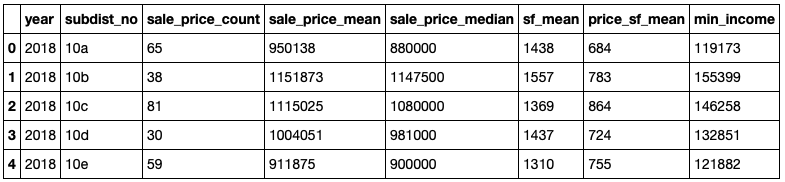
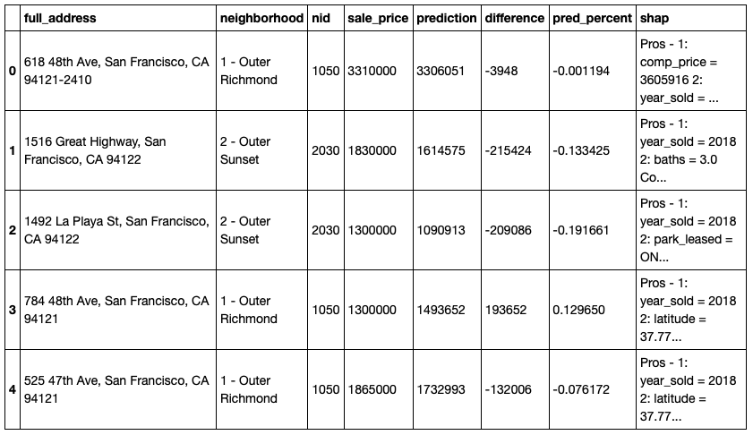
There are two dataframes of data used in the application: neighborhood data used to show aggregate statistics for 2018 for each neighborhood and display data for each individual property sold in 2018 produced by the linear regression code in my article “Look Out Zillow Here Comes Jestimate!”
neighborhood_data DataFrame
display_data DataFrame
Main Code for the Application
Let’s take a look at the main code for the application and then step through it in detail.
### Start of Main Program

# Input geojson source that contains features for plotting for:
# initial year 2018 and initial criteria sale_price_median
geosource = GeoJSONDataSource(geojson = json_data(2018))
original_geosource = geosource
input_field = 'sale_price_mean'

# Initialize the datatable - set datatable source, set intial neighborhood, set initial view by neighborhhood, set columns
source = ColumnDataSource(results_data)
hood = 'Bernal Heights'
subdist = '9a'
view1 = CDSView(source=source, filters=[GroupFilter(column_name='subdist_no', group=subdist)])
columns = [TableColumn(field = 'full_address', title = 'Address')]

# Define a sequential multi-hue color palette.
palette = brewer['Blues'][8]

# Reverse color order so that dark blue is highest obesity.
palette = palette[::-1]

#Add hover tool to view neighborhood stats
hover = HoverTool(tooltips = [ ('Neighborhood','@neighborhood_name'),
                               ('# Sales', '@sale_price_count'),
                               ('Average Price', '$@sale_price_mean{,}'),
                               ('Median Price', '$@sale_price_median{,}'),
                               ('Average SF', '@sf_mean{,}'),
                               ('Price/SF ', '$@price_sf_mean{,}'),
                               ('Income Needed', '$@min_income{,}')])

# Add tap tool to select neighborhood on map
tap = TapTool()

# Call the plotting function
p = make_plot(input_field)

# Load the datatable, neighborhood, address, actual price, predicted price and difference for display
data_table = DataTable(source = source, view = view1, columns = columns, width = 280, height = 280, editable = False)
tap_neighborhood = TextInput(value = hood, title = 'Neighborhood')
table_address = TextInput(value = '', title = 'Address')
table_actual = TextInput(value = '', title = 'Actual Sale Price')
table_predicted = TextInput(value = '', title = 'Predicted Sale Price')
table_diff = TextInput(value = '', title = 'Difference')
table_percent = TextInput(value = '', title = 'Error Percentage')
table_shap = TextInput(value = '', title = 'Impact Features (SHAP Values)')

# On change of source (datatable selection by mouse-click) fill the line items with values by property address
source.selected.on_change('indices', function_source)

# On change of geosource (neighborhood selection by mouse-click) fill the datatable with nieghborhood sales
geosource.selected.on_change('indices', function_geosource)

# Layout the components with the plot in row postion (0) and the other components in a column in row position (1)
layout = row(column(p, table_shap), column(tap_neighborhood, data_table, table_address,
              table_actual, table_predicted, table_diff, table_percent))

# Add the layout to the current document
curdoc().add_root(layout)

# Use the following code to test in a notebook
# Interactive features will not show in notebook
#output_notebook()
#show(p)
Step 1 - Initialize the Data
Bokeh offers several ways to work with data. In a typical Bokeh interactive graph the data source is a ColumnDataSource. This is a key concept in Bokeh. However, when using a map we use a GeoJSONDataSource. We will be using both!
# Input geojson source that contains features for plotting for:
# initial year 2018 and initial criteria sale_price_median
geosource = GeoJSONDataSource(geojson = json_data(2018))
original_geosource = geosource
input_field = 'sale_price_mean'

# Initialize the datatable - set datatable source, set intial neighborhood, set initial view by neighborhhood, set columns
source = ColumnDataSource(results_data)
hood = 'Bernal Heights'
subdist = '9a'
view1 = CDSView(source=source, filters=[GroupFilter(column_name='subdist_no', group=subdist)])
columns = [TableColumn(field = 'full_address', title = 'Address')]
We pass the json_data function the year of data we would like loaded (2018). The json_data function then pulls the data from neighborhood_data for the selected year and merges it with the mapping data returning the merged file converted into JSON format for the Bokeh server. Our GeoJSONDataSource is geosource. The initial_field is initialized with sale_price_mean.
Our ColumnDataSource, source, is initialized with the results_data and a Column Data Source View (CDSView), view1, is initialized with the Bernal Heights neighborhood (subdist=9a). CDSView is a method for filtering data allowing you to show a subset of the data, in this case the Bernal Heights neighborhood. The column of the datatable is initialized to display the full address of the property.
Step 2 - Initalize the ColorBar, Tools and Map Plot
# Define a sequential multi-hue color palette.
palette = brewer['Blues'][8]

# Reverse color order so that dark blue is highest obesity.
palette = palette[::-1]

#Add hover tool to view neighborhood stats
hover = HoverTool(tooltips = [ ('Neighborhood','@neighborhood_name'),
                               ('# Sales', '@sale_price_count'),
                               ('Average Price', '$@sale_price_mean{,}'),
                               ('Median Price', '$@sale_price_median{,}'),
                               ('Average SF', '@sf_mean{,}'),
                               ('Price/SF ', '$@price_sf_mean{,}'),
                               ('Income Needed', '$@min_income{,}')])

# Add tap tool to select neighborhood on map
tap = TapTool()

# Call the plotting function
p = make_plot(input_field)
The ColorBar palette, HoverTool and TapTool are initialized and the make_plot function is called creating the initial map plot showing the median price neighborhood heatmap.
Step 3 - Fill the Data Table and Text Fields with the Initial Data
# Load the datatable, neighborhood, address, actual price, predicted price and difference for display
data_table = DataTable(source = source, view = view1, columns = columns, width = 280, height = 280, editable = False)
tap_neighborhood = TextInput(value = hood, title = 'Neighborhood')
table_address = TextInput(value = '', title = 'Address')
table_actual = TextInput(value = '', title = 'Actual Sale Price')
table_predicted = TextInput(value = '', title = 'Predicted Sale Price')
table_diff = TextInput(value = '', title = 'Difference')
table_percent = TextInput(value = '', title = 'Error Percentage')
table_shap = TextInput(value = '', title = 'Impact Features (SHAP Values)')
The datatable is filled using the source (ColumnDataSource populated from results_data), view (view1 filtered for Bernal Heights), and columns (columns using only the full_address column). The TextInput widget in Bokeh is usually used to gather data from the user, but works perfectly fine for displaying data too! All the TextInput widgets are initialized with blanks.
Step 4 - The Callback Functions
This is were the key functionality for the interactivity comes into play. Bokeh widgets work on the callback principle using event handlers - either .on_change or .on_click - to provide custom interactive features. These event handlers then call custom callback functions in the form function(attr, old, new) where attr refers to the changed attribute’s name, and old and new refer to the previous and updated values of the attribute.
# On change of source (datatable selection by mouse-click) fill the line items with values by property address
source.selected.on_change('indices', function_source)
For the datatable, this was easy, simply using the selected.on_change event_handler for source and calling the function function_source when a user clicks on a row of the datatable passing it the index of the row. The TextInput values are then updated from the source (results_data) by the selected index from the datatable.
def function_source(attr, old, new):
    try:
        selected_index = source.selected.indices[0]
        table_address.value = str(source.data['full_address'][selected_index])
        table_actual.value = '${:,}'.format((source.data['sale_price'][selected_index]))
        table_predicted.value = '${:,}'.format((source.data['prediction'][selected_index]))
        table_diff.value = '${:,}'.format(source.data['difference'][selected_index])
        table_percent.value = '{0:.0%}'.format((source.data['pred_percent'][selected_index]))
        table_shap.value = source.data['shap'][selected_index]

    except IndexError:
        pass
For the map, I wanted to be able to click on a neighborhood and fill the datatable based on the neighborhood selected. Oddly, there was no built-in .on_click event handler for the HoverTool. It’s clear the HoverTool knows which neighborhood it is hovering over, so I built my own!
I realized there was a TapTool and after testing it with the map I discovered it works as a selection tool. In other words, when you click the mouse over a polygon on the map, it actually selects the polygon using the neighborhood id as the index! This also triggers the .on_change event handler in geosource. So, using the same basic method used for the datatable:
# On change of geosource (neighborhood selection by mouse-click) fill the datatable with nieghborhood sales
geosource.selected.on_change('indices', function_geosource)
For the map, use the selected.on_change event_handler for geosource and call the function function_geosource when a user clicks on a neighborhood passing it the index of the neighborhood. Based on the new index (the neighborhood id/subdistr_no), the CDSView is reset to the new neighborhood, the datatable is re-filled with the new data from the view, and the TextInput values are set to blanks.
# On change of geosource (neighborhood selection by mouse-click) fill the datatable with nieghborhood sales
def function_geosource(attr, old, new):
    try:
        selected_index = geosource.selected.indices[0]
        tap_neighborhood.value = sf.iloc[selected_index]['neighborhood_name']
        subdist = sf.iloc[selected_index]['subdist_no']
        hood = tap_neighborhood.value

        view1 = CDSView(source=source, filters=[GroupFilter(column_name='subdist_no', group=subdist)])
        columns = [TableColumn(field = 'full_address', title = 'Address')]

        data_table = DataTable(source = source, view = view1, columns = columns, width = 280, height = 280, editable = False)
        table_address.value = ''
        table_actual.value = ''
        table_predicted.value = ''
        table_diff.value = ''
        table_percent.value = ''
        table_shap.value = ''

        # Replace the updated datatable in the layout
        layout.children[1] = column(tap_neighborhood, data_table, table_address, table_actual, table_predicted,
                                    table_diff, table_percent)

    except IndexError:
        pass
Step 5 - The Layout and Document
Bokeh offers several layout options for arranging plots and widgets. The three core objects for layouts are row(), column() and widgetbox(). It helps to think of the screen as a document laid out as a grid with rows, columns. A widgetbox is a container for widgets. In the application, the components are laid out as two columns in one row:
- First Column - Contains the plot p (the map) and the TextInput widget table_shap (the Shapley value).
- Second Column - Contains the datatable tap_neighborhood and the rest of the TextInput widgets.
# Layout the components with the plot in row postion (0) and the other components in a column in row position (1)
layout = row(column(p, table_shap), column(tap_neighborhood, data_table, table_address,
              table_actual, table_predicted, table_diff, table_percent))

# Add the layout to the current document
curdoc().add_root(layout)
The layout is then added to the document for display.
This is Part of a Series of Articles Exploring San Francisco Real Estate Data
San Francisco Real Estate Data Source: San Francisco MLS, 2009-2018 Data